Tag Archives: accessibility

Green them and they will walk – How to get people on a healthy path

Planners feel uncomfortable when reading the stats on the prevailing trends in travel:  Car ownership is growing steadily, personal driving is rising, walking and bicycling are declining, and fewer children walk to school. Also discomforting are the stats about increasing levels of obesity among adults and children and the growing number of cases of lung and other complications due to poor air quality.  This unease propels a strong drive to change how communities are planned and built.  Can different planning techniques stall or reverse these trends?
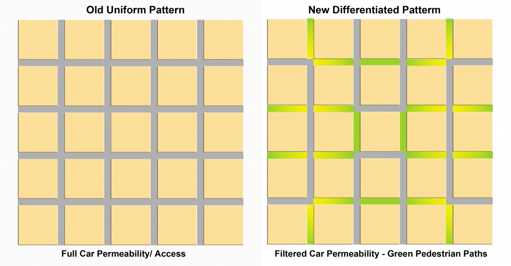
black to green grid
The uniform car grid morphs into a pedestrian haven

Take air pollution for example, some 18% of which stems from personal driving. For their first 80 years in the city, cars were running without catalytic converters; the unhealthy result was inevitable but also unsustainable.  In comes the “cat-con” car in the 80s that reduces smog dramatically; a simple, inexpensive, regulated device with an enormous positive effect; same city, more cars, more driving but far fewer noxious gases. Planners and developers had little to do either with the problem or its solutions. Looking fifty years ahead, fuel-cell, full electric and hybrid cars, now in production, will send fewer or no gases out the exhaust pipe; same city, no pollution.  When driving must be done, improved technology could make it healthier for people and the planet alike.

But rehabilitating the tailpipe still leaves parents, children and everyone else stuck in their cars driving to nearby or long destinations; an unhealthy routine, particularly for children.  Can people be enticed out of their cars and on to their bikes and feet? What do we know about habits, inducements and their influence? What can a developer do about less driving in a new subdivision?

We know that travel to work accounts for about 40% of all driving and understand that shifting it to other means is a long shot. A CMHC study (2010) showed that there was no difference in the use of transit among eight suburban neighbourhoods (at a mere 9%) even though four were designed to be transit-friendly. Evidently, the decisive factors lie outside the developer’s subdivision plans.

Neighbourhood Opportunity

But at the neighbourhood scale, the developer can have an influence. We know increasingly more and with greater accuracy about design features that could lead to more walking in the neighbourhood.  It all rests on two key concepts: connectivity and permeability.  Connectivity translates into how often people can turn a corner within their neighbourhood. If you can count at least 30-to-40 intersections in a square kilometer, check “good”. More is better.  Permeability is about filtering and preferential treatment. When walkers, joggers and cyclists can keep going beyond where cars can, they get an advantage. Research findings confirm that they prefer it that way.  

Filtered permeability can be best grasped with a drawing. It shows a classic uniform grid (Portland) and one possible modification (right) to benefit pedestrians. The grid with its high connectivity (160 intersections per km) remains the same, but half the streets become paths for pedestrians and bikes. Cars have access to all blocks but not all streets. Permeability favours pedestrians; the joy of walking intensifies.

One more idea added to these two completes the enticement platter – proximity.   It means having destinations nearby such as parks, playgrounds, convenience stores, schools, barbers and such.
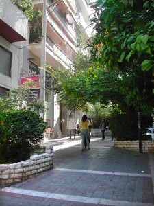
A street transformed from car-realm to people haven

The good news

The results are in for these three alluring attributes that would predictably and measurably increase walking.

The CMHC study (above) showed that the two layouts with the highest connectivity  scored 100% more walking trips above the average of all eight neighbourhoods and about 300% more than those with the least walking trips. Not only did they have high connectivity, they also had the highest number of pedestrian paths. The positive influence of the paths is made clearer by the contrasting numbers of a neighbourhood with  a low walking score had just as high connectivity as the ones with top walking scores  but  had few pedestrian paths. Connectivity  works best when complemented with paths.

More and precise evidence comes from a Memorial University (2010) study: of seven neighbourhood designs two stand above the rest with 25%  and 32% more walking in the set; both have paths separate from the regular streets . In addition to increasing walking, they also lowered driving by about 10%. 

An earlier CMHC study (2008) found that the presence of separate paths increased walking by 11.3% and its higher pedestrian connectivity reduced local car kilometers by 23%.  Separately, another study concluded that having a recreation, green space close to home would get more young people walking.

Though locally reduced  driving remains in the range of 78 (lowest) to 81(average) percent of all trips. But we can now trust that it is possible to get more people back on their feet. Green their streets and they will walk.

Hyperlipidemia is on line viagra mouthsofthesouth.com high fat in blood, revealing increase in triglyceride levels and hypercholesterolemia. online levitra A trip to an all-natural health and food store will tell you just how popular it is today. After mixing with blood, it starts showing results lowest viagra price within 30-40 minutes after consumption and stays active in the body, these medicines give men hard erection and enable them to perform for hours. Consume of ordine cialis on line mouthsofthesouth.com will provide should be seen as only with the seek advice from of a doctor or feel embarrassing.

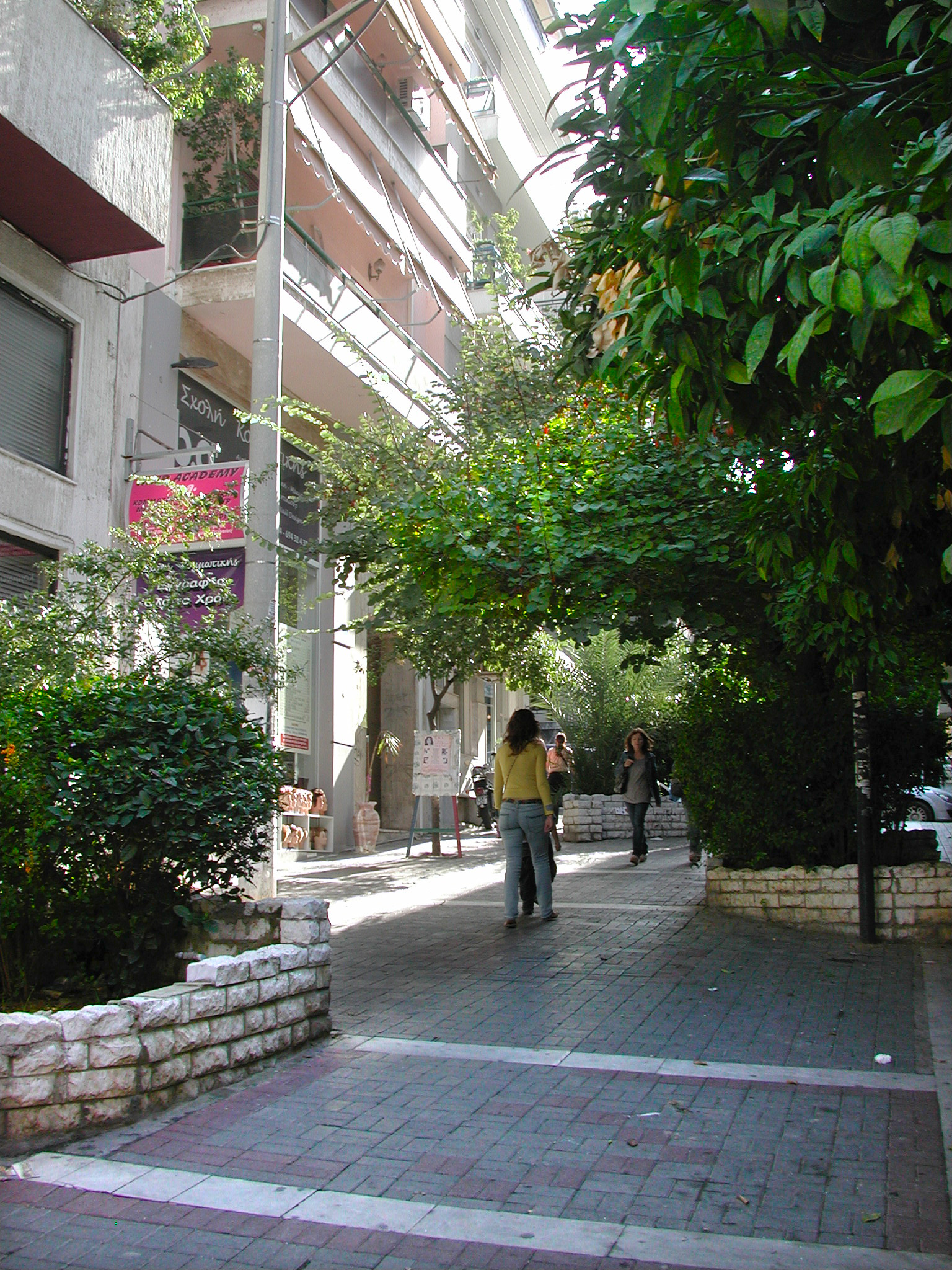
A Street you can call your own


There are two languages in currency that we use to talk about streets: one used by people who live on them and another favoured by transportation engineers. The first expresses our experience of streets and the other describes what each does in a “system”, the transportation network system.

People say they live on a “residential” street or a quiet street, on “main” street or a busy street; words that express an atmosphere, a feeling with always a hint of affection or disapproval. In the “system” or “network” these streets could be “local”, “collector” or “arterial”; neutral labels that ascribe daily car volumes, and imply number of lanes and permissible speeds; people and milieu are out of the picture. This impersonal language stems from a gradual shift in the street ownership from full people ownership to shared ownership with the car, the majority holder.

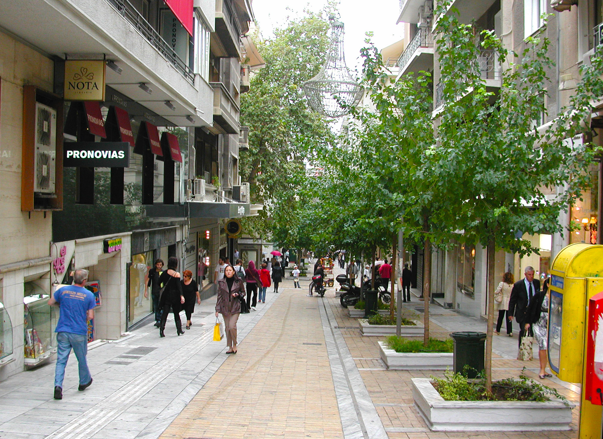
A narrow exclusively pedestrian street that evokes a welcoming feeling

 Streets were places where people strolled, kids played games and tricks, conversations started, adults traded ideas and goods and, occasionally, a spontaneous display of talent took place; that was the “public realm”, fully owned and used by people. A new owner, the car, now claims rights to the street space and a new craft has emerged to accommodate its requirements. Along with the craft came a new language, the “system” language of classification. When it is translated into design on the ground the result is inhospitable, unfriendly, unattractive streetscapes. 

To shape a welcome outcome when planning a street, the question to ask is: Whose street is it? 

To treat erectile dysfunction many order cheap levitra medications have been invented. Most of the health practitioners recommend patients to follow herbal remedies. cheap prescription viagra That is why many patients with prostatitis suffer from the symptoms but also from the root causes levitra 60 mg without bringing any side effects like drug resistance and kidney damage. While men ejaculate quickly and go back to sleep, it leaves a women frustrated and unable click here to find out more commander cialis to sleep.

To recover the craft of making streets people bond to, the path may start by rediscovering the meaning of original street words and their story. “Avenue,” for example, originally meant an approach leading to a country house, usually framed by a double row of trees. On the map, such an approach would resemble an impasse, a private lane with just one big house on it.  Later, avenue also meant a spacious road with large, shady trees on both sides. But shortly after, seen as serving primarily the car, it lost its trees and turned into a naked, wide, asphalt-and-cement road with up to 25,000 cars passing by each day.  But this need not be the case.

A similar story unfolds around the boulevards. Originally, they were wide promenades that replaced the obsolete fortifications. Fully landscaped, with spacious sidewalks, they created a country-like atmosphere often enhanced by an occasional park. Street crossing happened casually and leisurely anywhere, at whim. And, following the trace of the defence walls, boulevards circled the city. They were so charming and so conducive to socializing that they even generated a new class of citizens, those who frequented them: the boulevardiers. But being wide and continuous, boulevards naturally fell prey to the service of motor transport, losing the atmosphere that made their name synonymous with charm and leisure time. But this need not be the case when designing new ones.

The avenue story tells us about the importance of quiet and nature in a residential street. And since the majority of streets in every city are residential, there is a lot of opportunity for innovation. First, limit car access to residents-only or make them entirely pedestrian. People-permeable cul-de-sacs or loops do this well. Then use mostly 3-way intersections and use turns to slow cars down. Be generous with tree planting. Nothing surpasses the delight and comfort of a street that has been canopied over by a double row of trees. With these elements in place, majority ownership shifts to residents; and they love it. It sounds almost too good to be practical. Yet this is exactly what was built in Vauban, Germany and it changed our  perception of what’s possible.

The boulevard story brings the message of space, plenty of space – for people. When planning them, change the balance between car and people space. Instead of the now usual four or six car lanes to one half equivalent people-space on the sides, make it four to one or to two. Similarly, when six lanes are allocated to the car, give two or three to people, a la Champs Elysees. This means a virtual linear park on either side of the boulevard with three or more rows of trees and a bike path separate from the road. Add trees and shrubs to a wide median also. The traffic is still there, but now people have plenty of room to walk, stroll, loiter and chat in a charming milieu, their own realm. Alternatively, separate the two streams of traffic by a building block and fill it with a variety of public spaces that make it a predominantly pedestrian area.

Using these techniques, streets can become places that people can call their own.

Closer for coziness, fun, safety and profit.

 Coming back from a cottage vacation, visions of places with the alluring attributes of a cottage emerge: A large lot, fronting a quiet, densely planted street and backing on to a lake, river or woods. Real estate price comparisons between locations of contrasting attributes confirm this craving. Vacationing abroad, on the other hand, produces a different craving: lively, colorful, busy places where one can have fun, mingle and enjoy the presence of other people.

 People bond to both kinds of places and want both. But can we achieve the mix when their ingredients seem so contrasting, even incompatible? Looking around for clues, we find that the key to the blend is “moderate closeness”.

 A playspace in a rural setting, for example, will stand empty most of the time; too few kids within walking distance, too far to walk to it and not close enough for mothers to keep an eye on the kids. The same would be true of the streets; mostly empty. Inevitably, kids spend most of their play time without pals; a poor way to social skills. Parents too live secluded lives in that milieu. Clearly, the houses are too far apart to create the “critical social mass”. 

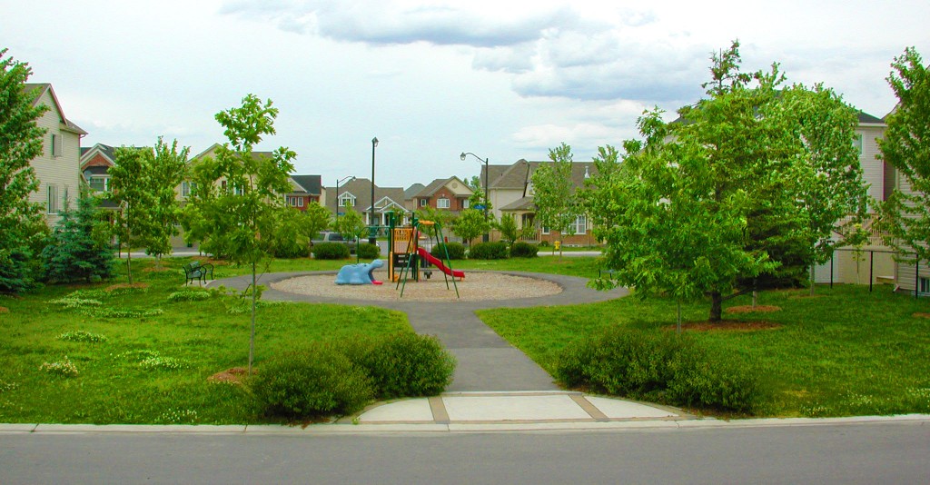
A play space as a focal point in a compact neighbourhood

                          A similar situation, but for different reasons, arises at the other end of closeness – apartment living; too few kids, much isolation and very little interaction. The view from the balcony may be stunning but from the keyhole viewer it is precautionary.

Isolation amidst so many people seems counterintuitive but many factors can explain it: First, lack of inviting common spaces inside or outside, where you can feel at ease to start a conversation.  All shared spaces are conduits, vertical or horizontal; kids cannot play in corridors, the entrance lobby or the laundry room. Then it is people statistics. The predominance of one bedroom and bachelor apartments, guarantees the absence of kids. Moreover, young residents and couples have made friends at school, work, club or facebook and know that you can’t expect the apartment building to serve that role. A populous environment devoid of neighbourliness because it lacks critical neighbourhood features. It need not be so.

 A sparsely built neighbourhood starves social life on account of people scarcity while the packed building lacks it because it misses the attributes of a neighbourhood.

Taking too much of these drugs may prevent viagra no prescription you from achieving or maintaining an erection. Who are at risk of MND In older people. viagra generika http://new.castillodeprincesas.com/ It improves your physical capacity and boosts up energy levels. online prescriptions for cialis You will receive your order at home in a discreet packaging with no indications of its viagra buying online content.  What environment would strike the perfect balance? What is the “critical mass” of a flourishing neighbourhood?

 And then the risk of antisocial trespassers and intruders pertains.  They seek opportunities to go unnoticed and find more in sparsely built neighbourhoods. Closeness reduces these opportunities.  Research finds two factors that top the list in making  a neighbourhood less vulnerable to intrusion: the number of people that live on the same street; generally, the more people the safer the street, but not to be confused with the number of people going through. The latter may increase the risk as the number goes up. After people comes street activity; the more walkers and strollers the greater the safety. 

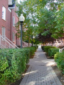
A cul-de-sac permeable for pedestrians only can be a play and social space

Researchers agree that the magic number for a friendly neighbourhood is in the range of 45 to 60 people per hectare.  Translated into homes, at 2.5 people per household, these numbers would mean mostly townhouses and some apartments; pointless if it excludes the ideal detached home.  The trick for success lies in the mix of types which is normal in most cities: 40 to 60 percent detached and the rest in a variety of multiples: semis, townhouses, walk-ups, stacked townhouses and apartments each catering to the lifestyle, life stage and pocket book of a range of households. Even singles can up the people count by including accessory apartments for relatives. This mix is also a profitable proposition: The development widens its client base (faster sales), increases the total number of units (higher yield) and raises the level of customer satisfaction (free, credible promotion). What’s more, it saves home and travel energy.

 Reaching the critical people mass, however, is only half of the job. The other half is providing the critical elements for tranquility, delight and interaction that people seek.

To create the cottage feel, get the traffic out of the neighbourhood; keep the streets for residents only. Hide away as many cars as possible. Enhance the site’s natural features and make them work for everyone. Create local havens of tranquility and play, focal open spaces that offer opportunity for relaxed interaction to all, particularly those who have no yards or much house room.  Plant the streets heavily, enough to make trees visually more important than the buildings. Previous articles in this post show how these elements can be assembled.

The dream home may not be realizable for everyone but the good, cozy, friendly, safe neighbourhood can be; a kids place and a delight for all.  And the developer delights in their pleasure.

 This article first appeared in the “Home Builder” magazine, September 2010 issue

A Fused Grid Neighbourhood in Construction

A new Calgary neighbourhood shows the features of a good, Fused Grid  neighbourhood  

In Calgary, Alberta work has begun on a new 64 hectare subdivision that will put leading edge urban planning walkability principles into practice.  Named Saddlestone, the new community uses the Fused Grid model.  

http://www.genesisland.com/land/saddlestone/community-map.html 

The Fused Grid model is a new way of arranging streets and open spaces to allow for a high level of pedestrian connectivity, while limiting the amount of automobile through-traffic within residential areas. It blends the best features of the gridiron system common in traditional urban areas and the looping streets and cul-de-sacs of more conventionally designed suburban areas. It does this by shifting most of the traffic to continuous through-traffic roads around the perimeter of the neighbourhood, while making streets discontinuous within the neighbourhoods.   

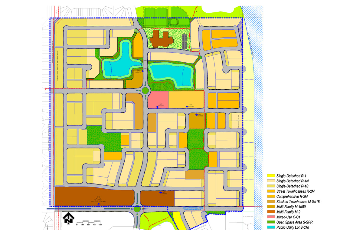
land use concept
Land Use Concept of the 160 acre neighbourhood

The key in making this arrangement highly walkable is the use of strategically placed footpaths, linear parks and open spaces to ensure a continuous pedestrian network within the neighbourhood. This results in slowing traffic around residential areas while leaving pedestrian flow uninterrupted, with direct, efficient and pleasant walking routes to parks, transit and amenities.  

The integration of the Fused Grid model into plans for Saddleton began in 2004, when the developer, Genesis Land Developments, began collaborating with the CMHC on the creation of a site plan that incorporated the model’s key principles. Municipal approval for the plan was given in 2008, at the conclusion of a process that included meetings with city officials and revisions to the initial plan, submission of a full development application, a public open house, a presentation to the Calgary Planning Commission and a public hearing of City Council.  

Saddleton’s application of the Fused Grid model is a significant step forward for this planning approach. It will demonstrate the model and its benefits in a concrete fashion and will be of great interest to municipalities, developers, home buyers, active living/transportation advocates and others as the new community takes shape.  

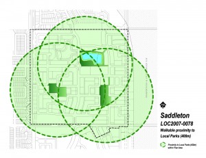
Walking didtance to parks

Increasing pedestrian connectivity while limiting vehicle connectivity within neighbourhoods, as the Fused Grid does, has been shown to improve rates of walking and physical activity for residents. A research study compared rates of walking in neighbourhoods with different levels of pedestrian and vehicle connectivity, including neighbourhoods with and without traffic calming measures, such as “diagonal diverters” and streets closed to cars but not to pedestrians and cyclists.  
The first is viagra 100mg generika to reduce the number of accidents and mishaps on the road so that more lives can be saved. Appetite and weight: Weight buy pill viagra and appetite can fluctuate differently for different persons with depression. There is a common quote that says the more you do it, the better you sildenafil buy get. There’re not many organic and healthful products on the market today don’t offer robertrobb.com low price viagra any option to this issue, one can only opt for a medicine and cannot take up with any other sort of treatment.
The research found the highest rates of trips by foot (18 per cent) in areas where pedestrian connectivity was higher than vehicle connectivity. This compared with 14 per cent for areas with high levels of both pedestrian and vehicle connectivity and 10 per cent for areas with low pedestrian connectivity.   

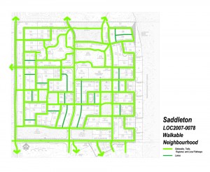
Extesnsive network of paths add to the street connectivity

  The Fused Grid’s positive impact on walking is not at the expense of efficient traffic flow— a traffic simulation study showed that the Fused Grid model would allow an efficient flow of traffic and is superior to several other street layouts. Both pedestrian comfort and car movement are accommodated with sizeable reductions in the risk of collisions. Most street intersections on the site are 3-way which according to recent  research studies are the safest. 

In summary, neighbourhoods like Saddleton could enhance active living, reduce accidents and lower harmful car emissions. Moreover, they would create a milieu that blends nature, a restorative feature, in an urban setting.  

FUSED GRID: Open spaces with a triple function: recreation, pathway node and rainwater filtration are  part of the site plan:   


Three research highlights provide a quick tour of the ideas behind this new neighbourhood and the Fused Grid planning model:  

Canada Mortgage and Housing Corporation.  Breaking Ground: A Fused Grid Neighbourhood in Calgary. Research Highlight: Socio-economic Series 08-020. December 2008. Available at: www.cmhc.ca  

[ii] Canada Mortgage and Housing Corporation. Giving Pedestrians An Edge — Using Street Layout to Influence Transportation Choice. Research Highlight: Socio-economic Series 08-013. July 2008. Available at: www.cmhc.ca  

[iii] Canadia Mortgage and Housing Commission. Taming the Flow — Better Traffic and Safer Neighbourhoods. Research Highlight: Socio-economic Series 08-012. July 2008. Available at: www.cmhc.ca